


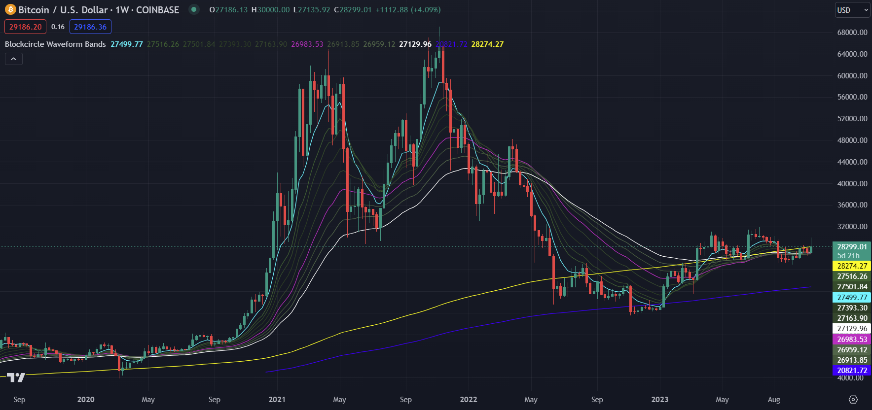
Using the Blockcircle Waveform Bands
Why use TradingView charts, Indicators and Technical Analysis?
- Making informed decisions about the timing of trades and investments ✅
- Identifying the direction and strength of trends ✅
- Indicators can help to smooth out the data and make it easier to see the trend ✅
- Understanding the volume of trading/investing behaviour from the market ✅
- Helping you to take action to improve your investment strategy 💪
What are Moving Averages (MAs)?
A Moving Average or MA (also known as a Simple Moving Average/SMA) is calculated by finding the average price of the previous candles.
For example, imagine an asset has the following closing prices over the previous 5 days (meaning we are on day 6):
$5, $15, $25, $25 and $30
To calculate a moving average (MA-5) we would add these together and divide by 5 to get the average price:
5 + 15 + 25 + 25 + 30 = 100 100 ÷ 5 = 20 so our MA-5 value is 20
What we would see on a chart is in the green colour for MA-5 is the start of a line at $20, starting on Day 6. It is then recalculated for day 7, however now Day 1 ($5) is out of the 5-day period and gets dropped; (15+25+25+30+35)/5 = 26). The MA-5 continues to be calculated for each candle after that, and it is joined with a line, forming the MA-5 indicator on the chart.
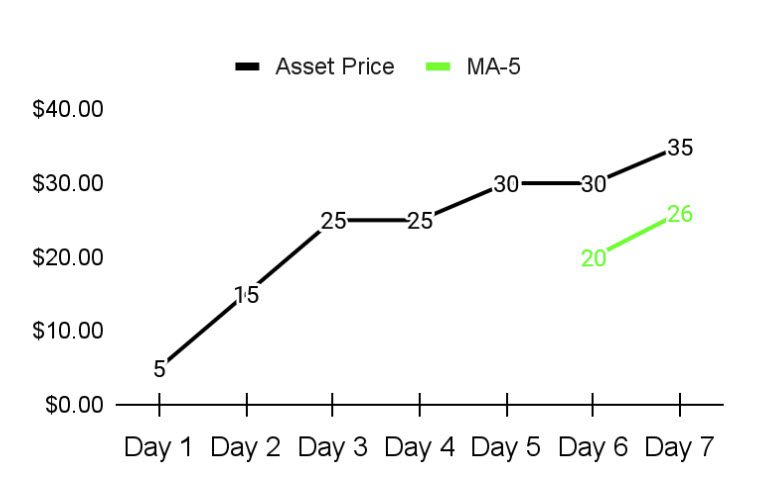
NB: It is useful to understand that the MA lines are charted over the actual price of the asset you are looking at, so MA-5 of 20 is displayed in the same place that a $20 current price would be on the chart.
Those new to technical analysis often mistake all chart indicators to be using a scale of their own or to be intentionally offset, because during an upward or downward trend in price indicators often appear to shadow the current price. Some technical indicators do use their own scale, MAs and EMAs do not.
The Blockcircle Waveform Bands use two Moving Averages
These two Moving Averages or MAs are used in analysis to provide a good gauge of the longer term trend direction and strength (for Trend Analysis, see more below).
MA-200 – a well known and widely used indicator for investigating long term trends, often considered to measure the general health and direction of an asset over a more extended period, also frequently used in combination with the MA-50 for the Golden Cross/Death Cross.
MA-314 – calculations related to Pi, not widely used and part of the Blockcircle special sauce, assets often wick to the 314 and find support or resistance if they move through the 200 with a lot of momentum.
What are Exponential Moving Averages (EMAs)?
Exponential Moving Averages also represent a way of charting the average price of previous candles. A mathematical weighting is applied to more recent candles.
Both EMAs and MAs are referred to as lagging indicators or trend-following indicators. We must keep in mind that they are using only historical data and do not predict any future price, for example a moving average price of $26 used in our example does not on it’s own predict any specific future price. Thus it is lagging indicator in terms of timing and not attempting to be a predictive indicator.
By weighting more recent candles, EMAs are intended to respond more quickly to changes in the trend direction and strength when compared to MAs.
The Blockcircle Waveform Bands use nine EMAs in total, with three being especially important (in bold):
EMA-8 – calculated based on the average of the past 8 candles, highlighted by a teal colour and thicker line, the 8 forms the top or bottom of the Bands during a clear trend, staying above the 8 while in an uptrend is a good indication that this trend will continue (and vice versa for a downtrend)
EMA-13 – calculated off the previous 13 candles, main function is to show the distance between the 8 and the 16, trends can be compressing or opening the Bands, grey thin line on the chart
EMA-16 – calculated off the previous 16 candles, main function is to show the distance between the 13 and the 21, trends can be compressing or opening the Bands, grey thin line on the chart
EMA-21 – calculated off the previous 21 candles, main function is to show the distance between the 16 and the 28, trends can be compressing or opening the Bands, grey thin line on the chart
EMA-28 – calculated off the previous 28 candles, main function is to show the distance between the 21 and the 30, trends can be compressing or opening the Bands, grey thin line on the chart
EMA-30 – calculated based on the average of the past 30 candles, highlighted by a purple colour and thicker line, the 30 is essentially the middle of the Bands and helps to show if the Bands are compressing or opening, as it is a kind of half-way point and also represents approximately one month on a 1 day chart a cross in either direction is significant
EMA-42 – calculated off the previous 42 candles, main function is to show the distance between the 30 and the 50, trends can be compressing or opening the Bands, grey thin line on the chart
EMA-50 – calculated off the previous 50 candles, main function is to show the distance between the 42 and the 60, trends can be compressing or opening the Bands, grey thin line on the chart
EMA-60 – calculated based on the average of the past 60 candles, highlighted by a white colour and thicker line, the 60 represents the bottom of the Bands, a cross through the 60 (rather than a bounce off it) tends to indicate a change of trend direction is occurring
Trend Analysis
Typically, we analyse trend direction and strength over multiple timeframes. This means we change the chart details between 1 month per candle, 1 week, 1 day, 12 hours and so on.
Important: The values for the Blockcircle Waveform Bands will be recalculated automatically. If each candle on the chart is 1 hour, then the 8 EMA will calculate from the previous 8 hourly candles. If the chart selected is monthly, then it will represent 8 monthly candles, which would typically be a large difference.
Using the EMA bands from 8 to 60, we can see when an asset has been trending up such as the Bitcoin bull run of 2017:
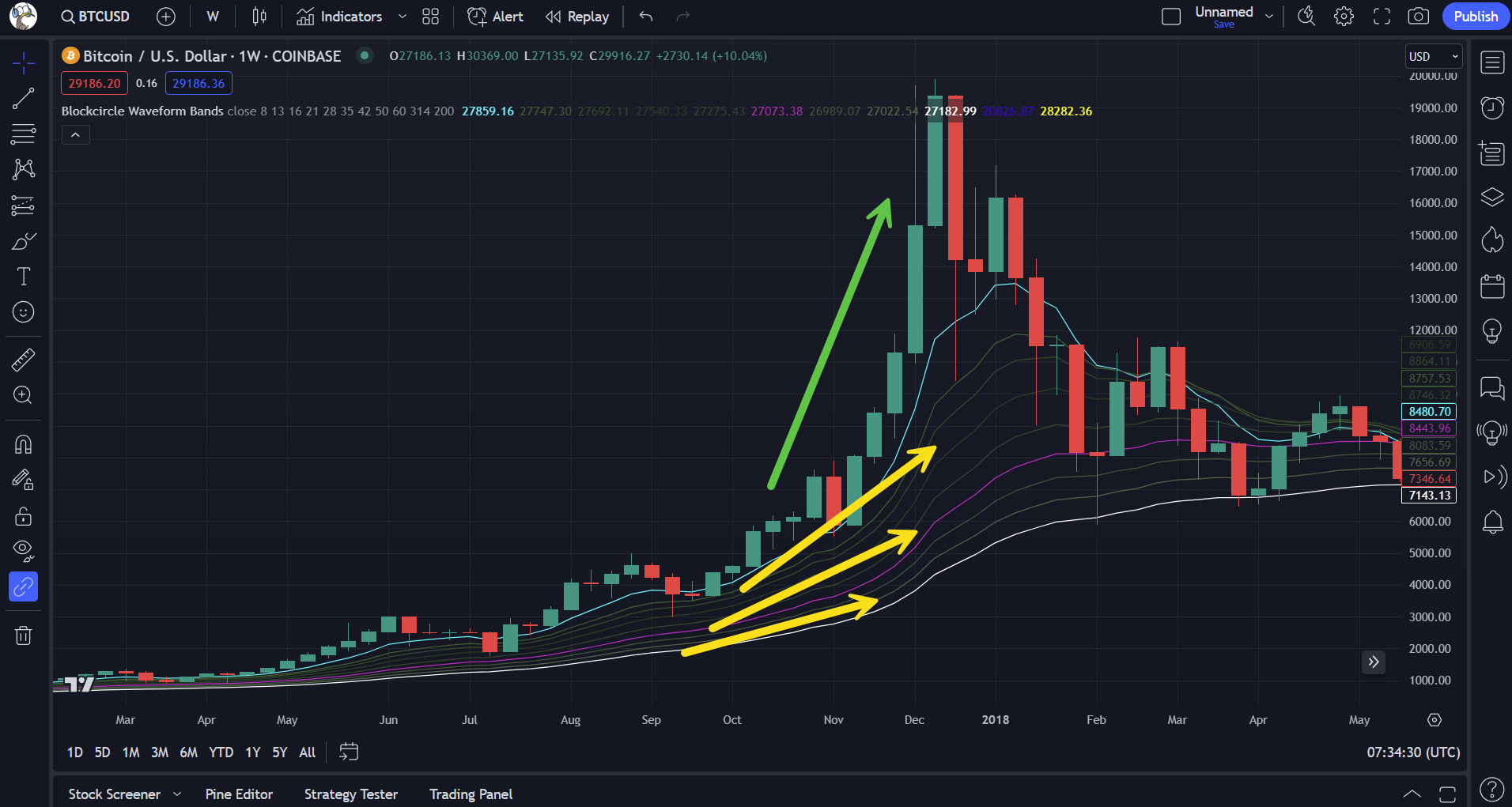
Above we see that the average of the past 8 weeks (Teal line) is moving higher more quickly than the average generated by the values of the other EMAs, and we see the Bands spread out during the Bull Run.
We can also analyse the trends during times such as the deep Bear Market of 2018/2019:
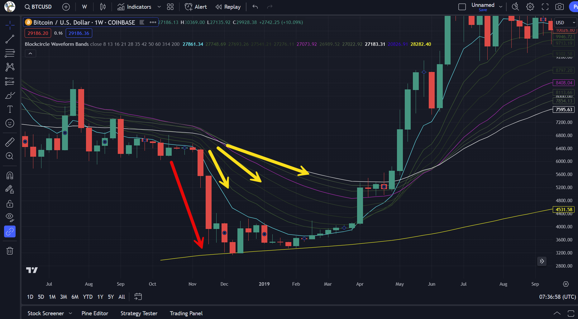
Once again, the EMA-8 or 8-EMA, is reacting to the drop in price more quickly than the longer periods, giving us a visual representation of the trend.
We can also see on these charts, the usefulness of MA-200 to visualize a support zone on the BTCUSD 1 week chart in December 2018:
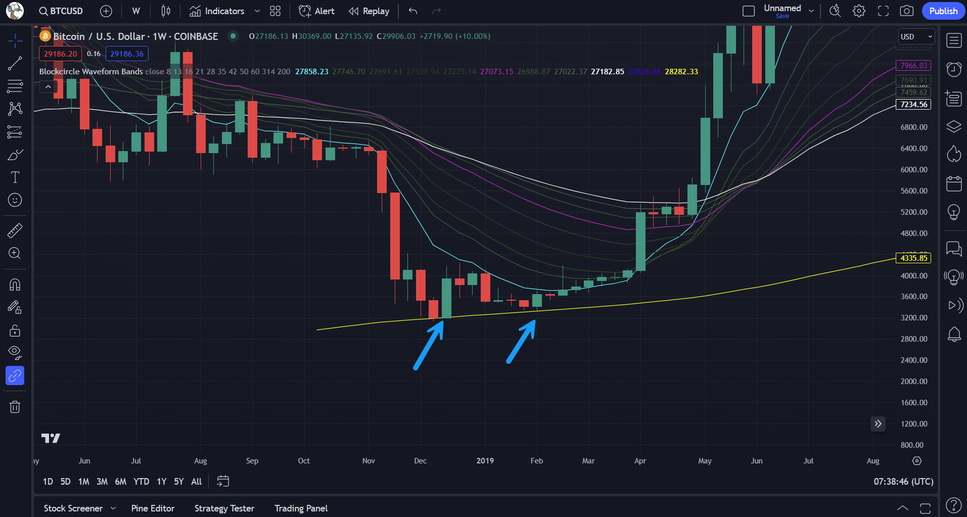
The price of Bitcoin did not significantly breach the weekly 200-MA shown in yellow. Traders may have used the 200, along with other technical analysis techniques, to make an educated guess as to where the Bitcoin price could stop trending lower and could turn around and trend higher in the future (also referred to as reversing the trend). In this case, their technical analysis was correct.
We find examples on many cryptocurrency and traditional stock trading charts, not just on the Bitcoin chart:
Solana’s 12hr uptrend since September 2023 as it became stronger:

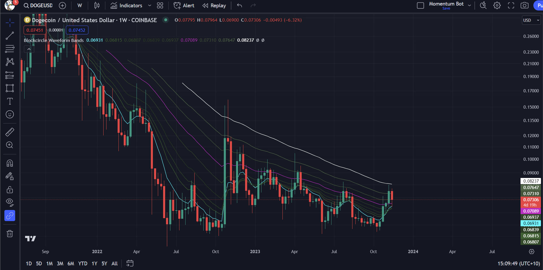
Dogecoin’s continuing downtrend throughout 2021, 2022 and 2023 despite price attempting to reverse it several times. Note that the price has been unable to cross all the 8-60 Bands convincingly and this gives us confidence that it is in a downtrend until price does escape the Bands and reverse the trend:
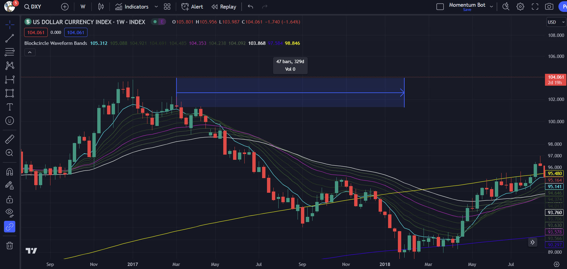
The US Dollar Index (DXY) trending downwards during the crypto Bull Run of 2017 below. Note how the DXY candles typically stayed under the teal 8-EMA for most of the period:
We can also see trend direction changes as the bands crossover themselves.
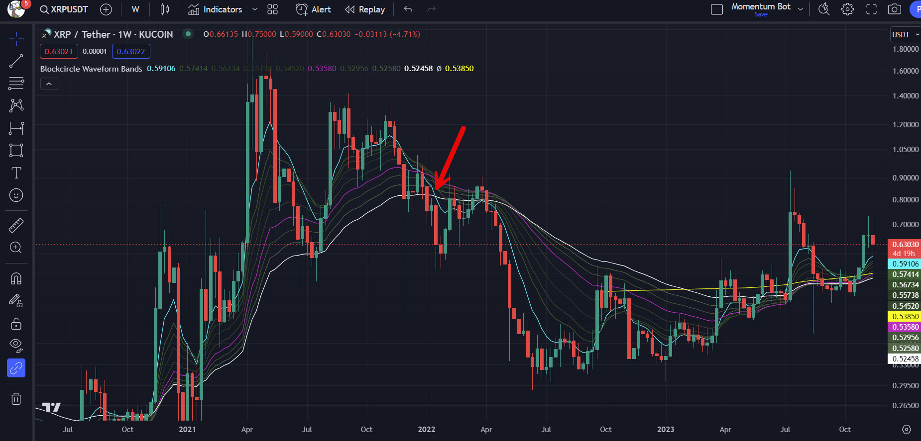
XRP weekly cross of 8-EMA and 60-EMA and the downtrend that followed:
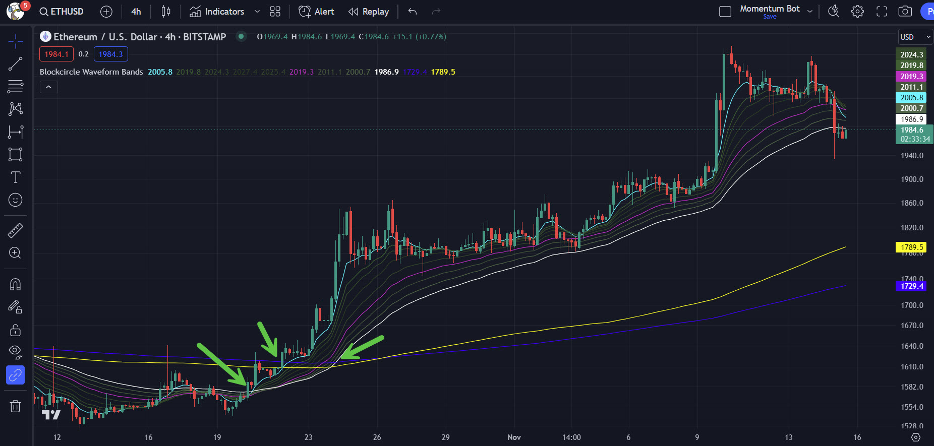
Ethereum 4 hour crosses, first of the 8 above the 60, then 200 and 314 through the 8, and finally through the 60. This could have given swing traders confidence that a strong uptrend was forming:
Summary
While being based on lagging rather than predictive indicators, the Blockcircle Waveform Bands provide a custom, proven tool for analysing historical price data to make informed decisions about the timing of trades and investments.
To start the guide again, return to Part 1: How to Find the Waveform Bands.