At first, using technical indicators for crypto trading may seem overwhelming, but if you take the time to fully understand the theories, you’ll find something unexpected.
In contrast to fundamental analysis, technical analysis can be simpler to understand. The top technical indicators for crypto trading will be covered in detail in this article, along with their appearance, usage, and combination to help you make wise trading decisions.
What are the top technical indicators for crypto?
To have a deeper understanding of technical indicators, it’s useful to open TradingView. This site tracks a wide range of assets and their markets, and you can also overlay the technical indicators on top of the price chart.
Without wasting too much time, here are the top technical indicators you’ve been wondering about:
Moving Averages
This is a trend indicator that’s the most commonly used, and the most easily understood. A moving average takes the average prices of the last “N” period. You can replace N with any number you want, but the most common moving averages are 10-period, 20-period, 50-period, and 200-period.
In fact, you should be able to spot some interesting patterns if you use these periods. The prices tend to “bounce off” the areas where you see the moving average lines. This is due to the fact that many traders base their trades on these indicators, because they are the most commonly used moving averages.
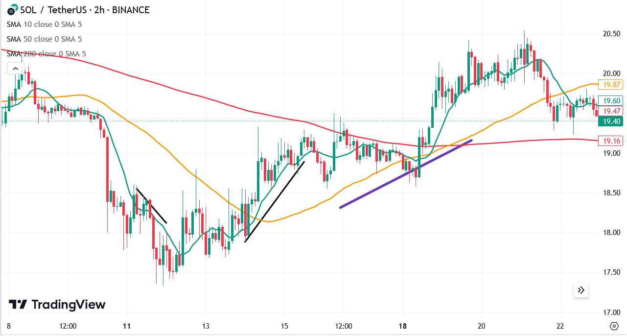
Take a look at this Solana / USDT chart. The green, yellow and red lines are the simple moving average 10, 50, and 200, respectively. The straight black lines are areas where the price has respected the 10-period moving average. The purple line is the area where the price has respected the 50-period moving average.
You might think, “Hey, I should place trades near the 10-period moving average”. And you could be right during periods of strong momentum. However, notice that there are exceptions. If you focus too much on the 10-period moving average, you’ll likely meet “bull traps” and “bear traps”. These are price actions whereby a “fake” breakout occurred because momentum is not strong enough to move the price up or down respectively.
A safer bet might be when you notice a confluence between the moving averages. On the purple line, the 10-period and the 50-period moving averages happen to touch each other several times, while trending upwards.
This highly likely indicates a potentially strong upward price, and you’d be right if you had entered long.
Heiken Ashi Candle
On TradingView, you can change your chart type. By default, it is set to the regular traditional candle-and-tail. However, you can also change it to the Heiken Ashi type. Some people don’t classify Heiken Ashi as a technical indicator, but we think as long as it helps you to see the price trends clearly, we’d give it a go.
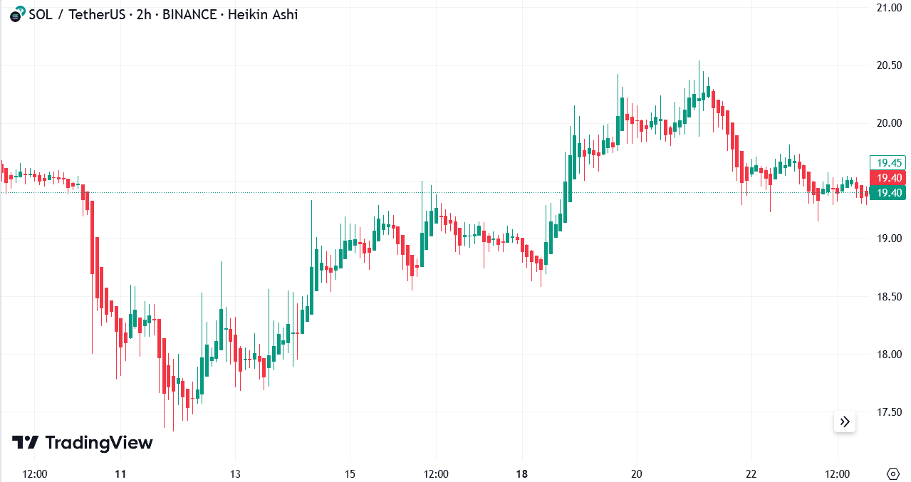
Compared to the regular candlestick chart, Heiken Ashi looks “nicer” or “cleaner”. That’s because it charts the prices into a mathematical function that smooths out any random volatility. Some traders like to use Heiken Ashi to enter or exit trades, although beware that it doesn’t reflect the real market price.
However, as a trend indicator, it works quite well. You can even deduce whether the next candle is a strong push upwards or downwards, making it somewhat of a momentum indicator too!
Relative Strength Index (RSI)
Relative Strength Index (RSI) measures the strength of an asset’s price action. Oftentimes, a price movement seems abnormal relative to the recent past, which indicates a change in the momentum.
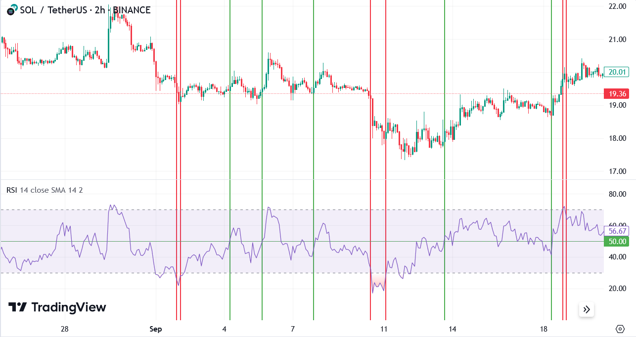
To see RSI in action, we need to peel back the SOL/USDT history a little bit further. On TradingView, the RSI is located below the price history chart. This is convenient because you can see that an RSI below 30 reflects a strong sell pressure (at the red double bands), which could indicate further selling action in the near future. However, an RSI above 50 all the way to 70 indicates high buying pressure, which predicts further upward price movement in the near future.
Be careful with this indicator. The RSI usually does not spend too much time above 70 or below 30 — these are known as the overbought and oversold periods, respectively, which could also indicate a weakening momentum as the price is about to correct itself.
Moving Average Convergence Divergence (MACD)
Moving Average Convergence Divergence (MACD) detects potential trend reversals and momentum shifts. The MACD looks a little more complicated, and indeed it’s more nuanced compared to the other indicators.
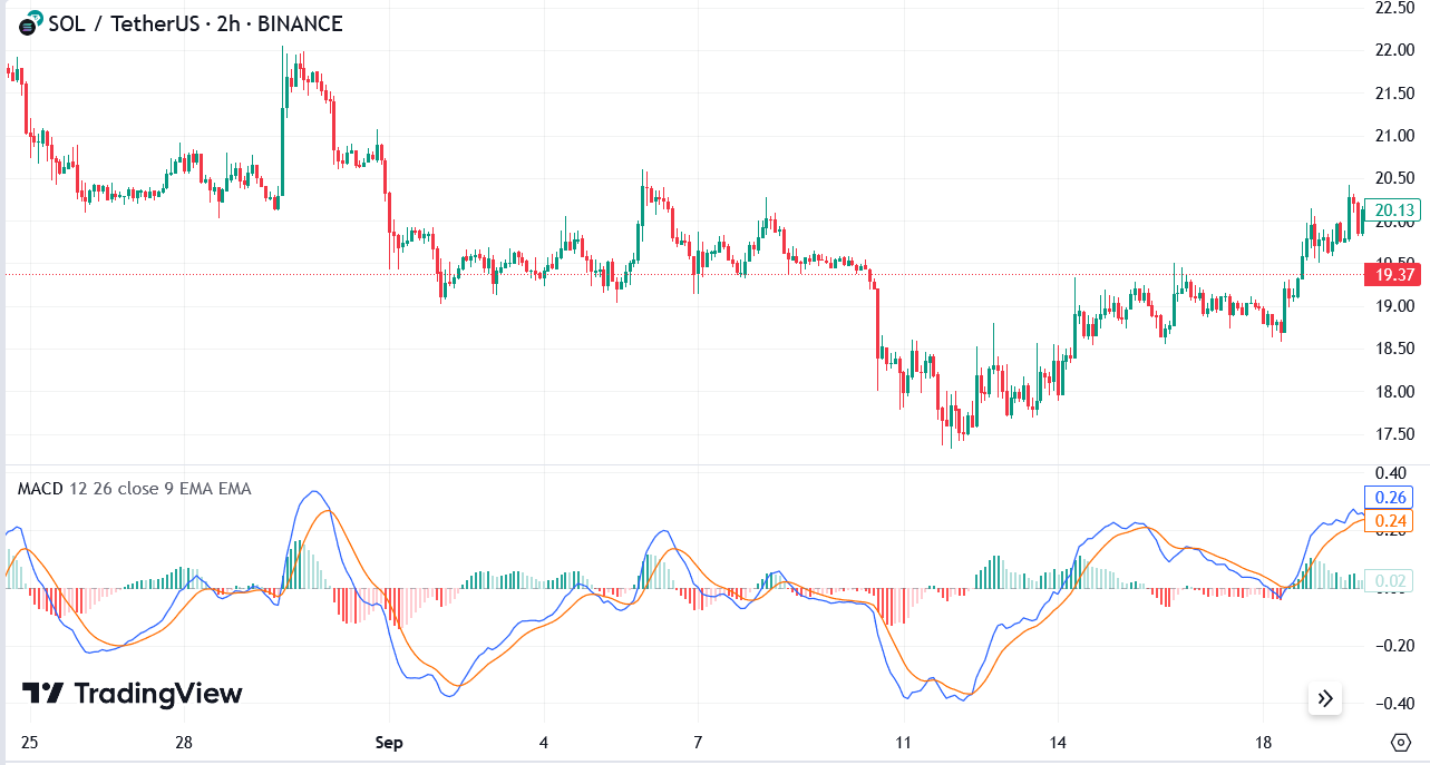
Since this is an introductory article on technical indicators, it’s best to leave the complicated explanations for another more in-depth article. For now, you should know that MACD is also quite popular because it can give a lot of insight to where the market will go in the near-term.
Bollinger Bands
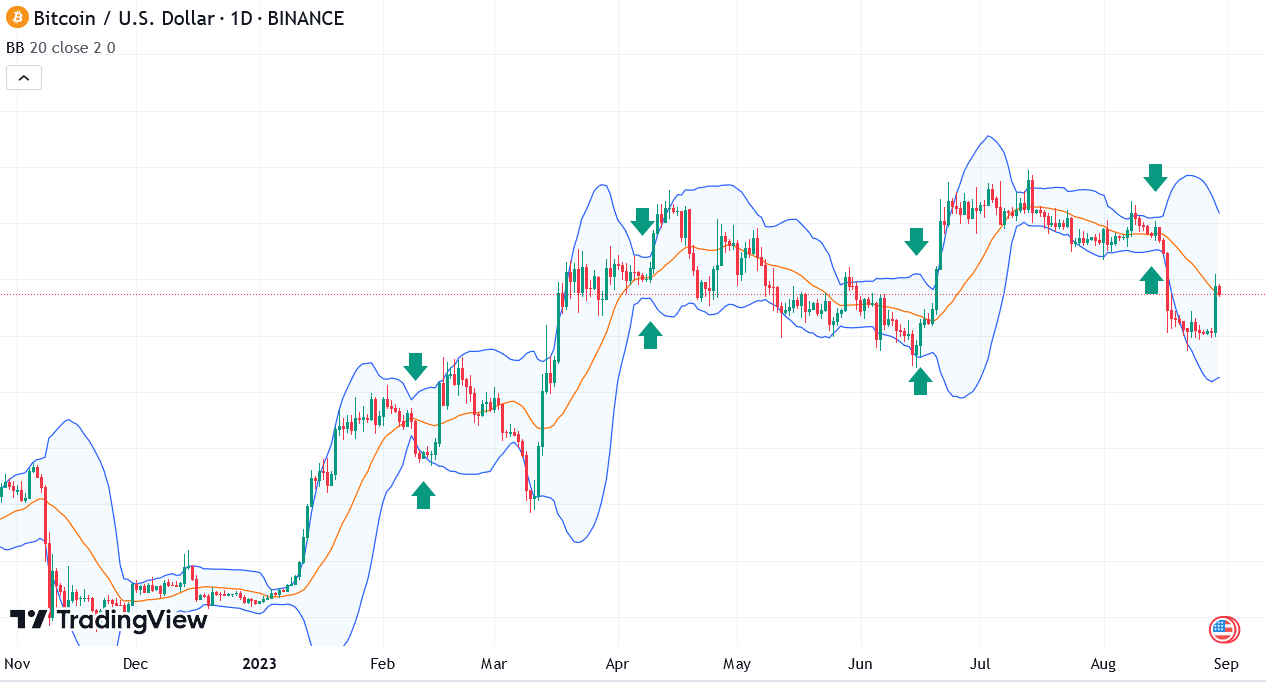
Bollinger Bands shows the price range within which a cryptocurrency typically trades in recent history (depending on your Bollinger Bands settings). What’s interesting about Bollinger Bands is that you can almost predict when big price movements (more volatile) will likely occur.
Below is the Bitcoin / USD chart, and you could see how when the Bollinger Bands tighten (analysts call this the “squeeze”), it’s nearly always followed by an unexpectedly highly volatile price movement in either direction.
Average True Range (ATR)
Average True Range (ATR) quantifies a cryptocurrency’s volatility. While many indicators like to use an index (i.e. a number relative to 1 or 100), the average true range uses actual figures to quantify the volatility.
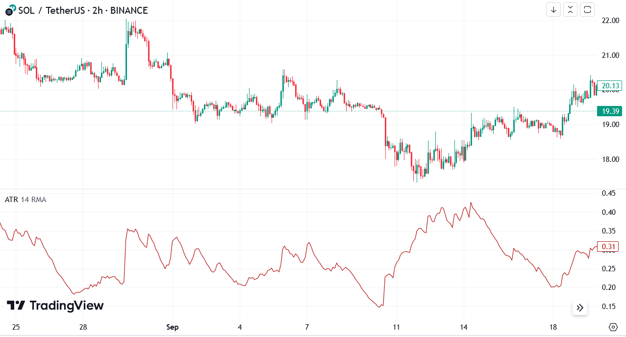
Back to the SOL/USDT chart, you could see how the ATR coincides with the price history. Of course, most traders would find the moving average of the ATR indicator as well as the moving average of the price to see if any patterns emerge. On its own, it’s unclear what ATR would indicate without the context.
Use technical indicators together
You’ve just learned about the six top technical indicators for crypto trading. Should you use all of them at once? Of course not! There’s such a thing as over analyzing and it could lead to making your charts look unreadable.
A good rule of thumb is to know how the technical indicators are categorized. You might already have a sense of this:
- Trend indicators: Moving average and Heiken Ashi
- Momentum indicators: Relative Strength Index and Moving Average Convergence/Divergence
- Volatility indicators: Bollinger Bands and Average True Range.
For each category of indicators, you can simply use one. For example, you can use the Moving Average, RSI and Bollinger Bands together.
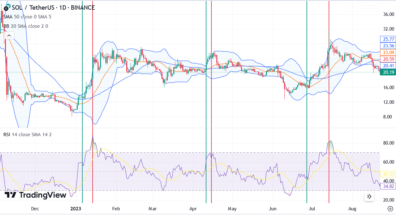
The green bands highlight where the RSI is in the oversold region (under 30) and where the Bollinger Band indicates a sudden increase in volatility. You could then use the moving average to determine the timing of entry where if the price is near the moving average line, it’s considered less risky to enter a trade.
The red bands highlight the RSI in the overbought region (over 70), indicating that a possible correction is imminent. In this particular example, the RSI has been used as the indicator to exit the trade.
The above example is a simplistic approach to trade using three technical indicators from each of the indicator categories. However, please note that this is not an exact rule. The indicators exist to offer you some weight for making trading decisions. Without additional “fundamental” data such as company/team/project announcements, social media sentiment, and on-chain analytics such as exchange in-and-outflows, there is still an element of chance when trading using technical analysis.
Blockcircle can help you make better decisions
Blockcircle is a private trading and investment management community of computer scientists, quant traders, financial engineers and executives that come together to combine all their skills and experiences to create high quality trading signals.
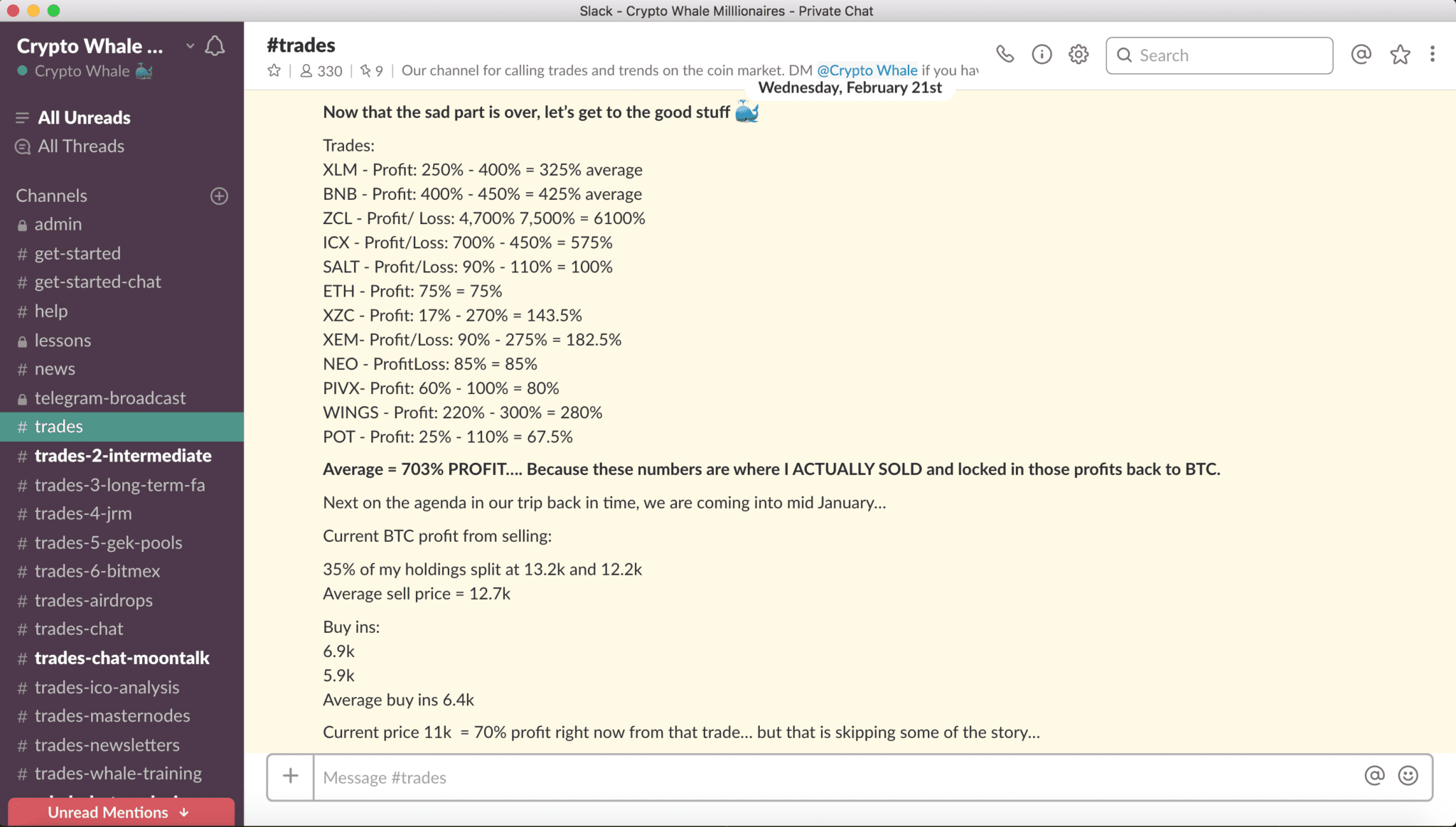
To give you a picture of how we work, we have sub-teams that focus on different aspects of the crypto market. We look for undervalued gems based on fundamental analysis, new token offerings on various centralized and decentralized exchanges, use off-chain and on-chain analytics, web traffic analytics, as well as the reliable and traditional technical analysis.
The group was founded in 2017 and has experienced two peak crypto bull markets in 2018 and 2021. These two periods of time have been a chance for many ordinary people to generate wealth, and become financially secure.
To learn more about what we can do for you, visit blockcircle.com.


