


Technical analysis helps predict how prices of financial assets, like cryptocurrencies, will move in the future. It looks at past price data and studies patterns, trends, and indicators on price charts to guide trading decisions.
Why It Matters
Technical analysis is really important for traders who trade in the short term, such as day traders, high-frequency traders, and those who follow price trends like trend or swing traders. If you’re using automated trading bots, understanding crypto technical analysis becomes even more crucial because these bots work based on these principles. If you fully understand technical analysis, you might have little control over how the bot operates and may lose money because of it.
Basic Ideas of Crypto Technical Analysis
Though it might sound complicated, technical analysis is based on some simple ideas you can easily get. The first one is about time frames. If you’re holding onto assets for a few days to weeks, it’s good to think about the price history in terms of days. If it’s over months, look at weeks. For traders doing quick trades, think about 30-minute periods.
Let’s say you’re a day trader, so you’ll focus on 30- to 15-minute time frames. This doesn’t mean you have to watch prices every 15 minutes, but just consider what happens every 15 minutes as useful info.
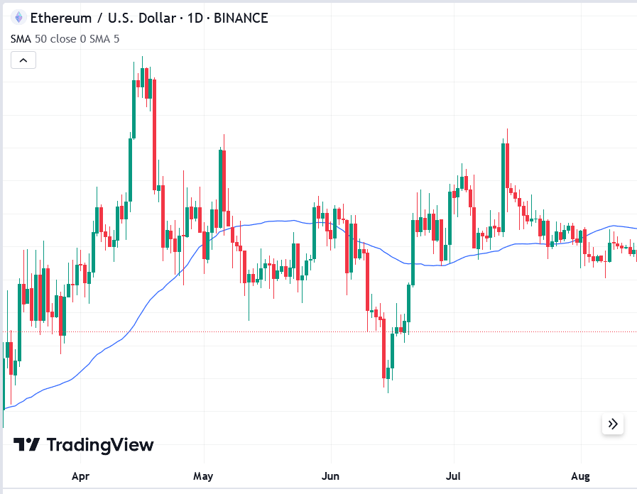
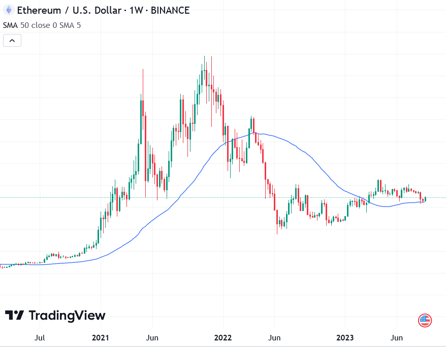
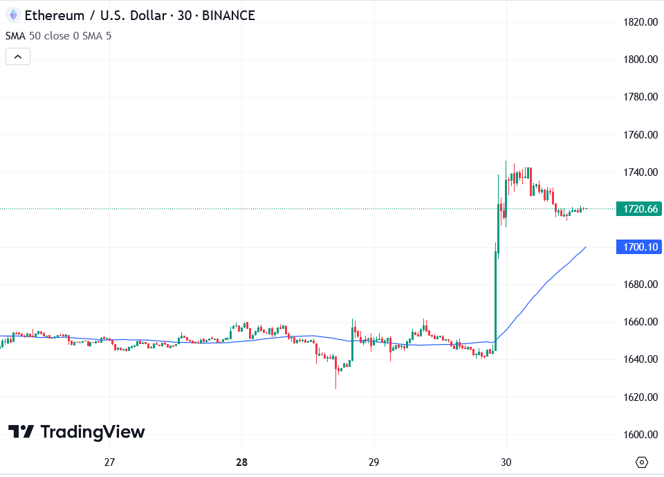
The next idea is moving averages, one of the top technical indicators. This is the average of prices over a certain number of time periods in the past. For day traders, a 20-period moving average means looking at the average price over the last 20 time periods (around 5 hours) and finding the average.
The history of moving averages makes a line that sort of follows the price history but not exactly. There are two types: the simple moving average, which averages all past prices, and the exponential moving average, which gives more weight to recent prices. This makes it quicker to react to price changes.
Another thing to know is resistance and support lines. Throughout history, prices often hit certain points and then bounce back. If a price level resists going down and makes the price bounce, that’s a support area. If it resists going up and makes the price bounce down, that’s a resistance area.
Strong support or resistance lines are hard to break. But if there’s a big price movement or a lot of trading at that level, it can break. These lines aren’t set in stone, and they can change over time. So, your strategies need to adapt to these changes.
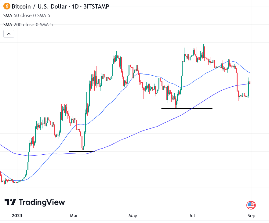
These lines can also come from moving averages. When prices go up a lot, traders expect the price to eventually fall back towards the moving average. In that case, the moving average becomes a support line. Trading near this line increases the chance of the price going up and reduces the chance of it crashing down.
From these ideas, you can make more advanced strategies. You can create a chart with multiple moving averages and understand other stuff like Bollinger Bands and MACD. Doing this gives you a bigger picture of what’s happening in the market.
Other Technical Indicators to Consider
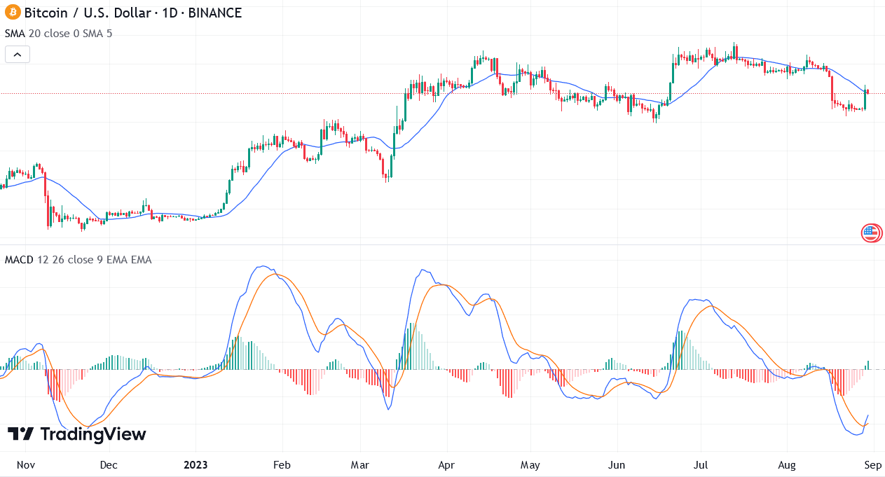
Moving Average Convergence Divergence (MACD)
The MACD is a handy tool that tracks three moving averages. It calculates the difference between the 12-period exponential moving average and the 26-period exponential moving average to form the MACD line. Additionally, the 9-period moving average of the MACD line creates the “signal line.
On a typical MACD chart, you’ll notice a lot of action. Let’s take a closer look at each element. The blue line represents the MACD line, and the orange line represents the signal line. The histogram shows the gap between the MACD line and the signal line. A dark green bar indicates divergence, with the signal line above the MACD line.
Analysts often see a dark green bar on the MACD chart as a strong bullish signal. The lighter green signifies convergence, suggesting that the MACD and signal lines are coming closer. When they flip positions, with the MACD line above the signal line, the histogram bar turns dark red. This change is seen as a potent bearish signal.
The convergence or divergence between the MACD and signal lines offers insights into potential trend reversals and their perceived strength.
Bollinger Bands
Bollinger Bands gauge volatility and potential price shifts in cryptocurrencies and other financial assets. They consist of three main parts: a middle band (usually a simple moving average), an upper band (typically two standard deviations above the middle band), and a lower band (usually two standard deviations below the middle band).
Unlike using one or two simple moving averages, Bollinger Bands employ a single simple moving average and add two additional lines, indicating the average prices at two standard deviations above and below the moving average. This forms a triple-line band.
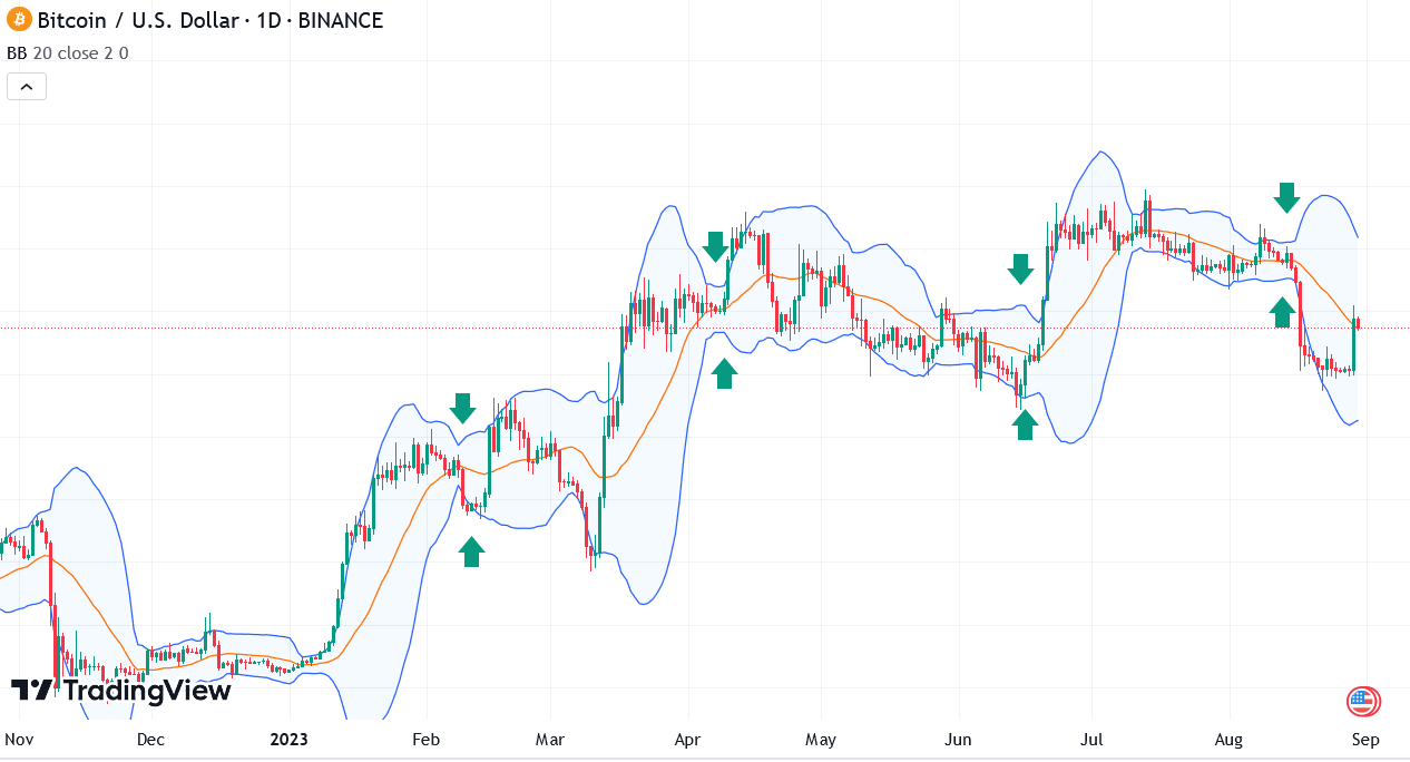
No worries if you’re not a statistics whiz, because Bollinger Bands don’t rely heavily on statistics. Instead, they focus on standard deviations due to a recurring pattern known as “the squeeze.”
The squeeze happens when the market’s volatility is low compared to its recent past. This often precedes a substantial price movement.
Contrary to popular misconceptions among new traders, Bollinger Bands don’t pinpoint trade timing, nor do they independently predict price swings. However, when combined with MACD or even another moving average indicator, they can work wonders.
Learning More about Technical Indicators
The realm of technical indicators is extensive and can get intricate. Approach it gradually. Start by understanding moving averages and recognizing support and resistance areas or lines as you go.
When you’re ready, delve into how the MACD chart corresponds with price history and identify breakout points and trend reversals. Learn about Bollinger Bands to spot the squeeze and anticipate significant price shifts. Remember to use indicators together and validate every pattern you come across.
For instance, if the MACD signal suggests a bullish move, corroborate it with two or more moving averages like those at 50, 20, and 10 periods. Use Bollinger Bands to confirm the strength of this bullish move, gearing up for imminent trades.
Once you’re prepared to explore further concepts in technical analysis, you can dive into topics like the Relative Strength Index, Average True Range, and Trade Volume.
Best of luck, and enjoy the process!